Note: This article discusses Poppulo Harmony Omnichannel reports. If you are not a Harmony Omni customer and would like to learn more please contact your Customer Success Manager or Support.
The Email Sends & Open Heatmaps dashboard allows you to see the busiest times for Email sends and when your employees are most likely to open them.
This article provides information on how to find this report, how to filter it, and a break down of the various report tiles within the Send & Open Heatmaps dashboard.
Note: It can take up to 24 hours after an Email send for data to process and display in this report.
Note: Within your Poppulo Harmony account, you can hover over the info markers on each report tile for further information as needed.
This reports is available as an Account report only.
-
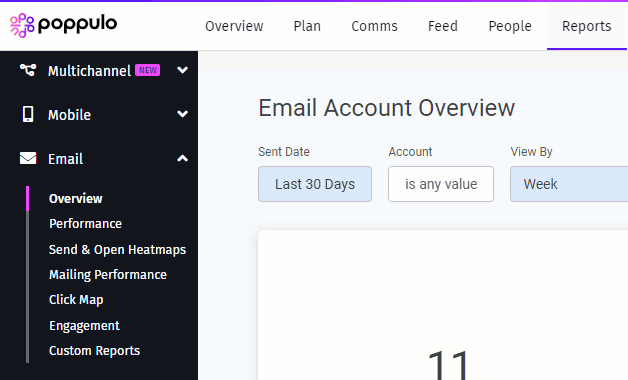
In the Reports Area of your Account, select Send & Open Heatmaps from the Email reports menu on the left.
-
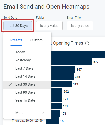
These reports can be filtered by Sent Date; Standard Date Range filter based on Email send date. You can select from preset or custom date ranges.
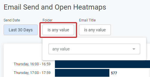
Select one or multiple Email Folders to view the related data. Select the drop-down arrow to choose your folder.
Select the name of one or multiple Email Titles to view the related data. Select the drop-down arrow to choose your Email.
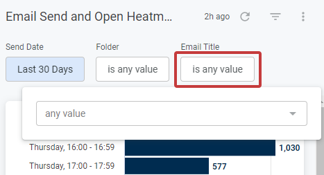
- Whenever you make changes to your filter, remember to select the Update button, at the top right of the screen, to view the updated results.
The following section is a break down of each report tile in the
Send & Open Heatmaps dashboard.
Note: You can also Download Reports, from any of your report tiles, by hovering over the tile, selecting the Tile Actions (the 3-dot icon), and choosing Download data. 
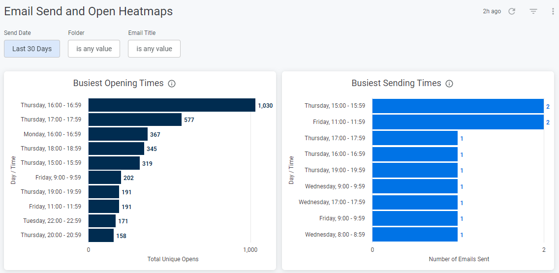
- Busiest Opening Times: Shows the busiest hour and day of the week for most Email opens. The graph is ranked from highest to lowest time periods.
- Busiest Sending Times: Shows the busiest hour and day of the week for Email sends. As before, the graph is ranked from highest to lowest time periods.
Unique Opens Per HourThis table shows the total Unique Opens that occurred hourly for each day of the week. This is for all Emails sent in the selected date range. The colors highlight the busiest hours (darkest) to least busy (lightest).
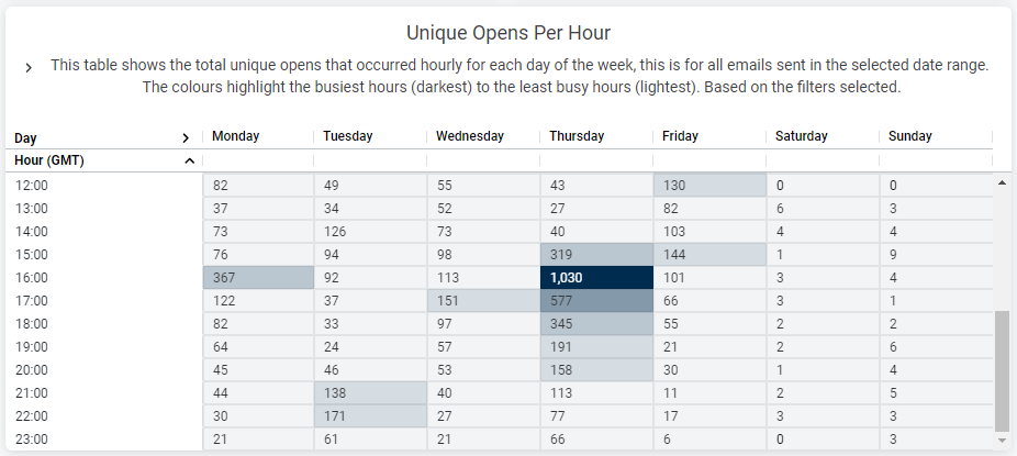
You can view more hours by using the scrollbar to the right of the table.
Email Sends Per HourThis table shows the number of Email Sends that occurred hourly for each day of the week. Like the table above it, it highlights the busiest hours in a darker color and the least busy in a lighter shade.
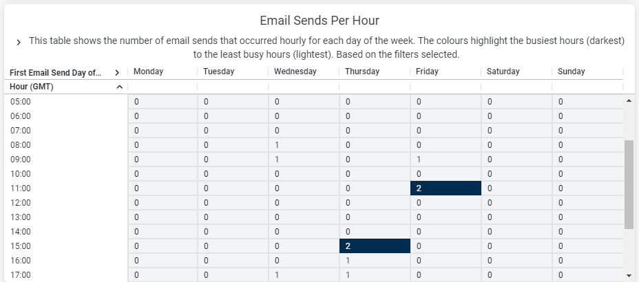
You can view more hours by using the scrollbar to the right of the table.
Related Articles:
