What is Responsive Email Design?
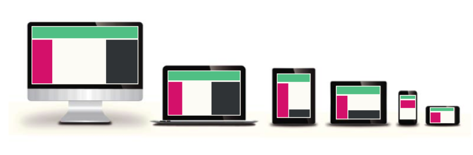
Responsive email design allows an email to respond in real time to the screen size on which it is being viewed e.g. if you're viewing on an iPhone 5, the email will automatically resize to that particular model's screen size. It's used to provide an optimised email user experience across a range of devices - from desktop to tablet to mobile.
How Does Responsive Email Work?
A responsive email uses a piece of code to detect the screen size of the device being used to open the email. Depending on the device detected the email client will trigger the appropriate stylesheet which in turn changes the layout to best match that particular screen size.
What Devices Support Responsive Email?
Below is a breakdown of the supported apps and devices.
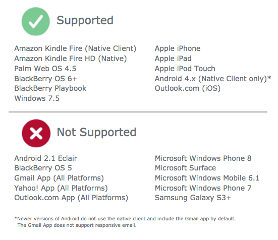
Note: Responsive email support is not determined by which device is being used, the email client app determines what support is available.
Is Responsive Email Design the Right Solution for me?
Responsive design can achieve amazing results when implemented. If you have a large B2C audience or more than 30% of your readers regularly open your emails on an email client that supports responsive design, then you will likely see many benefits from implementing a responsive design.
What to Consider:
It takes time and effort on all sides to get a responsive design right and so this should be weighed up against the benefits. If you have a low mobile readership or your mobile readers are on a devices that do not support responsive design then you are not likely to see much return on your investment.
What is Possible with Responsive Email Design?
With responsive email design the desktop template is manipulated in real time so that it displays well on smaller screens. It is not a separate template.
Here are some of the techniques to give you an idea of what’s possible when converting a standard template to a responsive design: Change from a 2 or 3 column layout to 1 column layout; Scale Fonts; Scale Images; Hide Content.
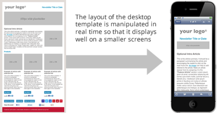
It is not possible however to add elements to a responsive design that are not visible on the desktop version.
Responsive Email Design Checklist:
Use our handy checklist to ensure your responsive email will be a success:
| ✓ |
Large B2C audience
|
| ✓ |
Or >30% on compatible email apps (see above for compatible apps)
|
| ✓ |
Email content can be adapted to suit the needs of a mobile audience
|
| ✓ |
Email design is mobile friendly and suitable for conversion to responsive
If not consider a redesign with mobile first in mind
|
| ✓ |
Landing pages and websites linked from your email are mobile friendly
e.g. is your corporate website or intranet responsive or mobile friendly?
|
| ✓ |
Check that alternative text is in place on all images
|
| ✓ |
Calls to action are touch friendly
|
Responsive Design Versus Mobile Version
A common feature of modern email design is the Mobile Version. This is a different technique to responsive design.
The difference is that the reader of the email must follow a link in order to view the mobile version rather than seeing the optimised version up front. The advantage however is that the Mobile Version can be seen by audiences that use devices or apps that do not support responsive design e.g. BlackBerry or Gmail.
