What is a Mobile Friendly design?
A mobile friendly approach to email design means ensuring a good user experience on small screens. Mobile friendly designs avoid the need for your audience to zoom in and out in order to view content. They also make it easy to navigate through the email from a mobile phone. The end result is that all mobile users who receive your email get the best experience possible.
Why make your email mobile friendly?
The needs of the mobile user are very different to those of the traditional desktop user.
Factors that influence how mobile users consume content:
-
Smaller screen size
-
Touch interface
-
Environmental factors: various locations; distractions; limited time
-
Network limitations: download limits; bad connections
-
Technology: older phones; software support
-
Device orientation: landscape; portrait
Extra challenges we face with email on mobiles include:
-
The mobile inbox: how different email clients display email
-
Devices with images in emails turned off as default
-
Varied support for responsive design
All of these factors are very different to the needs of a desktop user. This guide will explain when to consider the mobile user and how design and content choices can help solve many of these issues.
The mobile inbox
There are two ‘stages of interaction’ in the mobile inbox to consider:
First, viewing the message in the inbox itself (where the user would see the subject line, from name and the first sentence of text). See the screenshot below to see a typical iPhone and Android inbox.
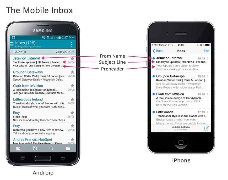
Second, when the email is opened it can display in several different ways depending on the device and email client (for instance, an email will display very differently on a BlackBerry to an iPhone).
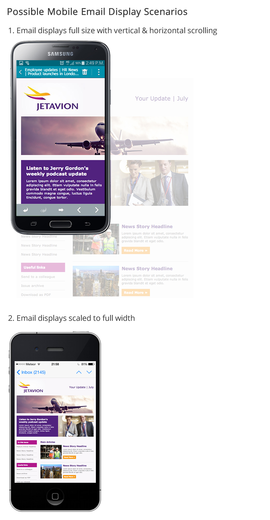
Unless you optimise your emails for reading across all of these different devices, your email may be unreadable. You can find out how to make your templates more mobile friendly below.
How do I make my email mobile friendly?
There are a four areas to consider:
(If you’d like to add any of the features below to your template please contact your Poppulo Customer Service Manager).
1. Content
Consider all aspects of your content when building your email:
-
Think about your subject line: keep it under 30 characters to ensure that all words will be displayed on a mobile device.
-
Use pre-header text: A pre-header is the text following the subject line when an email is preview. Try to keep it to a maximum of 50 characters so that will display in the inbox.
-
Try to reduce the amount of content: mobile users will generally be reading on the run, so try to make your content easily scannable, with a summary at the start of each article so they can quickly get the gist of your message (see Writing for Online Newsletters for tips on how to make your content more user-friendly).
-
Consider producing mobile specific content: If a proportion of your audience are using devices (you can check device usage in your Poppulo reports) consider creating Dynamic Content aimed at mobile users
-
Consider connectivity issues on mobile devices: Download speeds and connections are often far weaker on mobile devices. Try to avoid using large files and images, as they will take a lot of time (and data) to download
2. Template Design
Here’s a few simple guidelines to follow to ensure your template is mobile friendly:
-
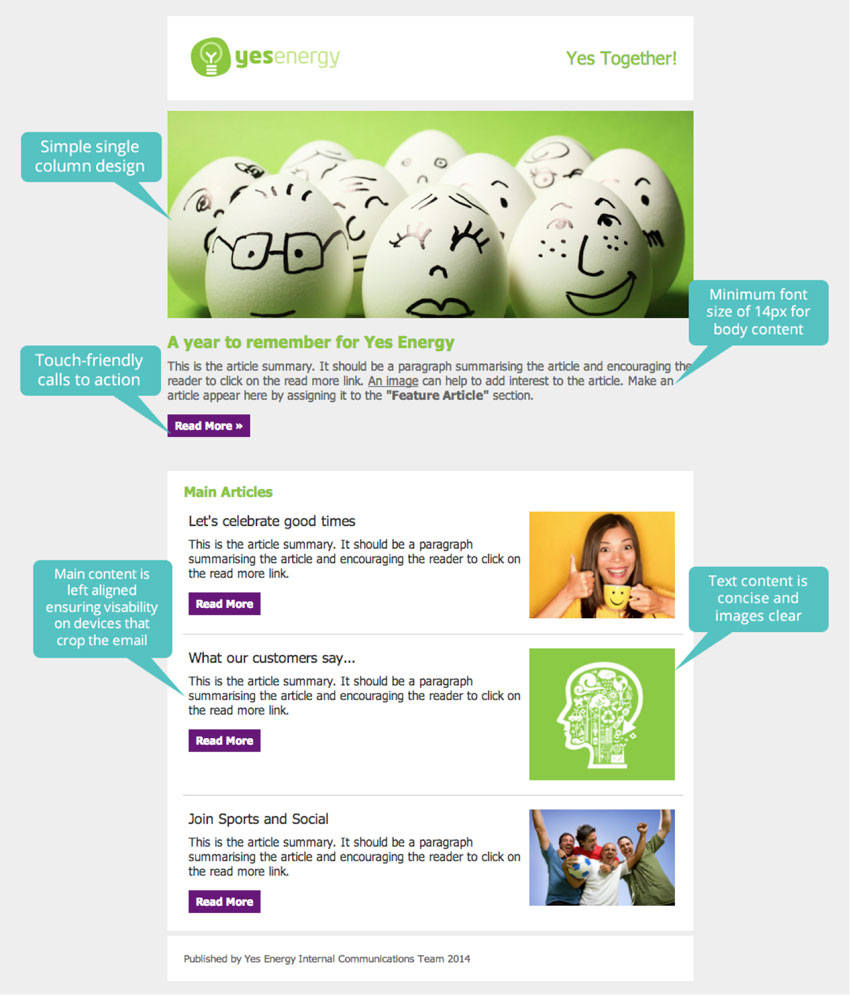
Preferably use a one column layout: this is the easiest to view on mobile devices (if using two-column layout, ensure article content is on the left)
-
Place key info and calls to action on the left of your template: If your email won’t scale for mobile users, make sure important info is on the left so they don’t need to scroll across to view key messages)
-
Ensure your email width is not larger than 640px
-
Use a minimum font size of 14px
-
Design emphasis should be on ease and speed of use: cut any design elements that are not essential to the brand or to conveying the message.
3. Usability
How people interact with mobile devices is very different to how they use a desktop computer. Consider the following:
-
Use large touch-friendly buttons for main calls to action: Should be at least 46px squared
-
Make good use of white space (especially between links): so that users can scan and easily touch links. Try to avoid listing links directly after each other
-
Mobile device users instinctively scroll downward: making the concept of ‘below the fold’ less important
4. Onward Journey
Ensure that the mobile user is catered for from beginning to end. For the best possible experience, landing pages and other websites (including your intranet) linked from your email should also be mobile friendly.
Design Strategies
A Mobile Friendly Email
Creating a mobile friendly email by following the advice above is your first step in supporting your mobile audience (talk to your Poppulo CSM if you’d like to add any of the features listed above to your newsletter).
Depending on what devices your audience are using the following two additional strategies may further improve your email’s success on mobile devices.
Responsive Design
Responsive email design allows an email to respond in real time to the screen size on which it is being viewed. The email content resizes or moves so that the user can read the email without having to scroll sideways or zoom in on content.
For more information, see our article on Responsive Email Design.
However it’s important not to rely solely on this technique. Not all mobile devices and email apps support responsive design, so don’t skip the basic steps of mobile friendliness. If you’ve done nothing else to make your email mobile friendly and only made it responsive then a lot of your effort may be wasted.
The Mobile Version
A common feature of email design is the Mobile Version. This is different to responsive design.
The difference is that the reader of the email must follow a link in order to view the mobile version rather than seeing the optimised version up front. The advantage however is that the Mobile Version can be seen by audiences that use devices or apps that do not support responsive design and have a poor mobile experience e.g. BlackBerry or Gmail App.
Know your audience
Before choosing a strategy, it's important to understand your audience and which environments are most frequently used to view your emails. Once you have this data, you can determine your investment into your mobile strategy.
Device reporting in Poppulo
You can view what devices your employees are currently using to view Poppulo content by accessing the Platform metrics from the Reports tab, for any all-employee email that you've sent. See
Platform Reports for details on how to find this information.
Mobile Friendly Design Checklist
-
What are the key mobile devices I need to cater for (based on analytics data)?
-
How does your messaging and content need to be adapted to suit the needs of mobile users?
-
Do I need to differentiate messaging and content at device level (e.g. different Folders for mobile and desktop)?
-
Do I have a responsive template or do I need to create one?
-
Are calls to action touchscreen friendly?
-
Are onward journeys (website; landing pages; intranet) mobile friendly?
-
Have I used files and images optimised for web usage to minimise download time? (Basically, don’t use huge files!)
-
Have I added alt-tags to the images?
-
Have I tested the email across all key email clients? (Poppulo’s design team will test this for you).
