You've Added Content to your email and everything appears to be going smoothly until you press the preview button and suddenly things look off-centre and it looks like the email is not aligned.
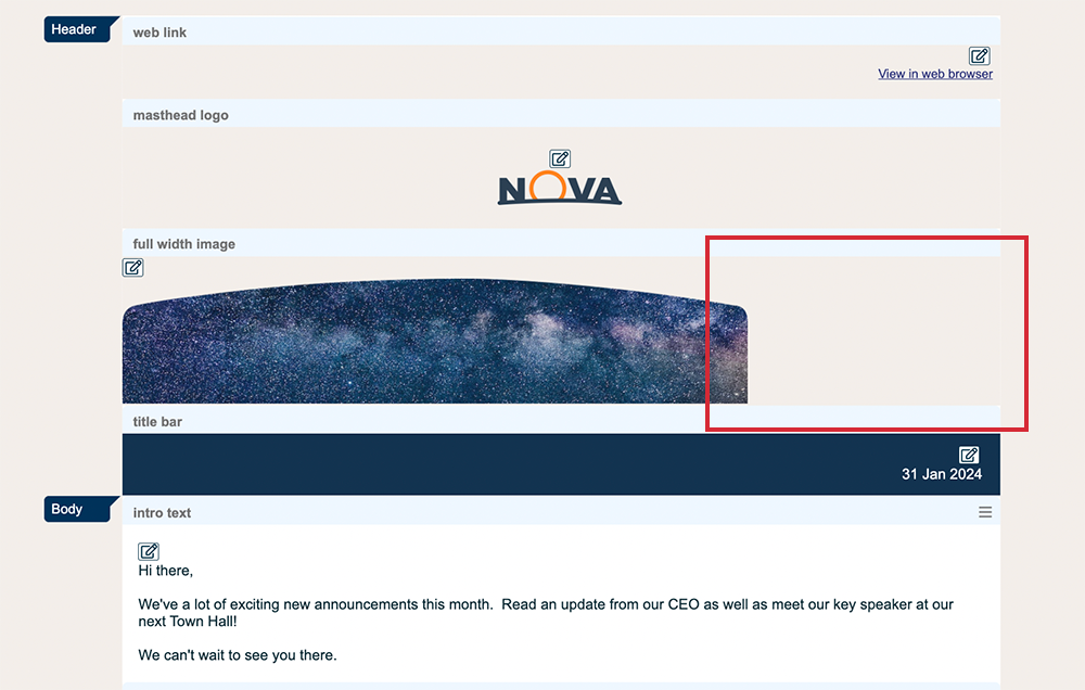
Your masthead, or banner image might look aligned left when you wanted it to be centred or it might appear to be too narrow; not stretching the whole length of the email. The problem is rarely with the masthead image itself but somewhere else in your email. Please read through our troubleshooting guide to help fix the most common causes of this issue.
- Check the size of your email template
- Check for images larger than your template width
- Check for tables
- Check for long URLs
- Check for long words in your article titles and summary
- Check your Full Story
If issues still persist after reviewing the checklist, please see "My email still doesn't look right"
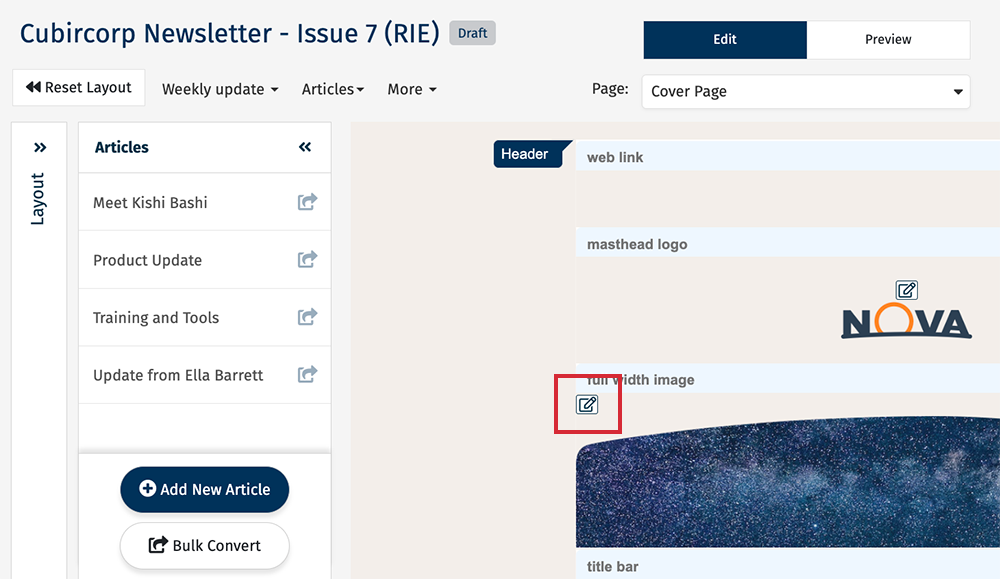
Select the pencil and paper edit icon of your masthead image.
Make sure that the box for Fit to template is checked. leaving it unchecked can lead to email distortion or stretching.
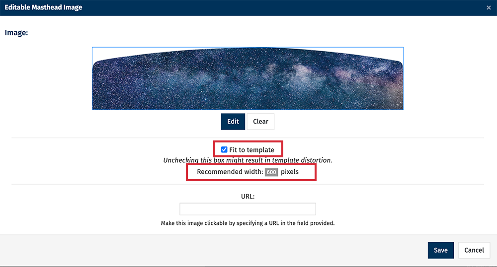
Make note of Recommended width; this is the width of your email template, so you should ensure that no images inserted into the article summary text field are larger than this recommended width.
Note: Poppulo recommends you upload high resolution images and Add Images using Placeholders and make use of the Fit to Template option seen here. Poppulo does not scale images up.
The most common cause of this issue is images inserted directly into the Summary Content Editor.
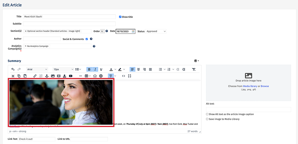
The safest way to insert an image into your summary is to use Placeholders.
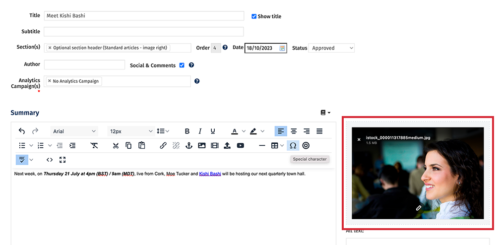
Placeholders automatically resize to fit your template, whereas images added via the Content Editor may break the formatting of your email if they are larger than your template width.
If you must use images outside of placeholders in your summary, make sure that they are less than your template width whilst leaving enough room for padding (at least 20px on each side of the image). You can Resize an Image within Poppulo Harmony by Using the Image Editor.
Note: If you are working with 2 or 3 column layouts, the image size will have to be divided by 2 or 3 respectively, with room for padding. For example, an email template width of 600 px could accommodate a 2 column article with summary images of 240px each without leading to stretching.
If you have used
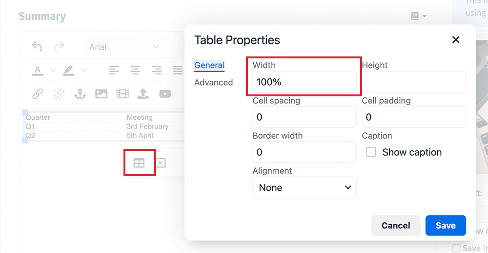
a Table in your summary content, make sure that the width of the table is set to 100%. Anything larger than 100%, or wider in pixel width than your email template, may stretch the email.
Learn more about
Creating Tables in Poppulo Email in our
Poppulo Academy. Email training@poppulo.com to ask for a
Branch Code if you need to register as a new user.
Long URLs can often be the culprit to template stretching.
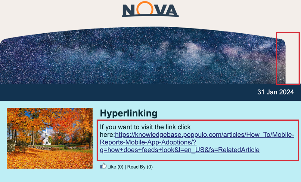
The easiest and safest way to include a link to a long URL is to Create a Hyperlink.
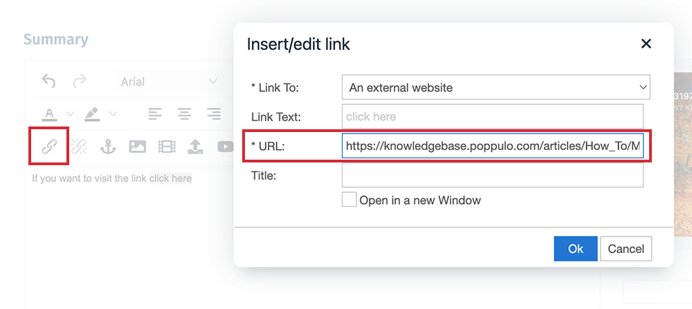
Alternatively, choose a shortened version of your URL if one is available, or use a URL shortener tool.
Particularly in relation to 2 and 3 column article layouts; the available width of these layouts is limited, so occasionally a long word in the title or summary can stretch the email template.
Content in the Full Story won't cause stretching on the front page, but it can cause stretching in the back page/article page of your email. If you notice any stretching of your email outside of the front page, please consult the above steps in regards to the Full Story section of your articles.
If you have checked for all of the above and there are still stretching issues with your email, please contact Poppulo Support.

