Note: This article discusses Mobile. These reports are accessible by users at both Enterprise and sub-account levels.
Mobile reporting gives you access to 3 Mobile dashboards:
This article provides information on how to find your reports, how to filter them, and a break down of the various report tiles within the Mobile Engagement dashboard.
The Mobile Engagement dashboard gives you a deeper view into the employee activity within the Mobile App, looking at new vs returning users and average interaction rates.
Note: Within your Poppulo account, you can hover over the info markers on each report tile for further information as needed.
-
In your account, click Reports > Mobile > Engagement.
-
These reports can be filtered by Date Range and Date Granularity, by choosing options in the Date Range and View By drop-downs and selecting the Update button.
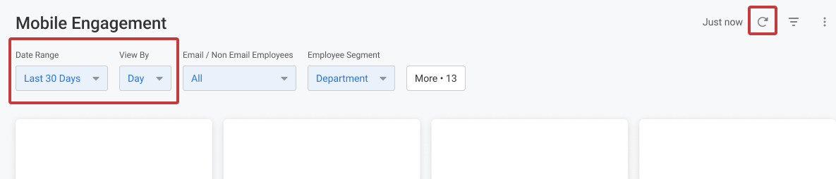
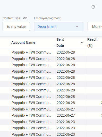
The results can also be filtered by Employee Segment (By default the table is segmented by Department, but there are more filters to choose from the drop-down).
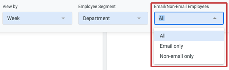
You can also filter your results by Email or Non-Email Employees. This filter will update the dashboard to show results for employees who authenticated the Mobile app by email address or by other non-email methods; for example, deskless workers who do not log in using a corporate email address. By default, the dashboard will load All employee results.
Note: All calculations will be based on the filters a user has selected, unless otherwise stated.
- Whenever you make changes to your filter, remember to select the Update button, at the top right of the screen, to view the updated results.
The following section is a break down of each report tile in the Mobile Engagements dashboard.
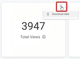
Note: You can also Download Reports, from any of your report tiles, by hovering over the tile, selecting the Tile Actions (the 3-dot icon), and choosing Download data.
Keep in mind that each report is based on your selected Date Ranges, Employee Segments and More Filters.
Top Line Metrics
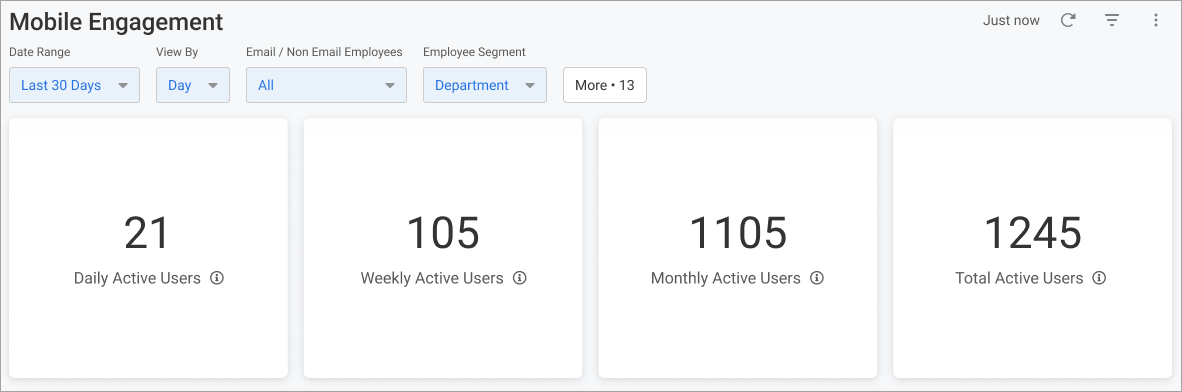
Daily Active Users
Total number of unique active users in the last 24 hour period.
Weekly Active Users
Total number of unique active users in the last 7 day period.
Monthly Active Users
Total number of unique active users in the last 30 day period.
Total Active Users
Total number of unique active users who have viewed at least 1 post, based on the filters selected.
- - -
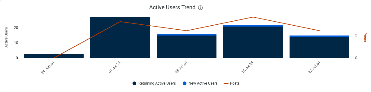
Active Users Trend
The total number of New unique active users vs Returning active users in the Mobile App.
Avg. Post Views & Interaction Rate
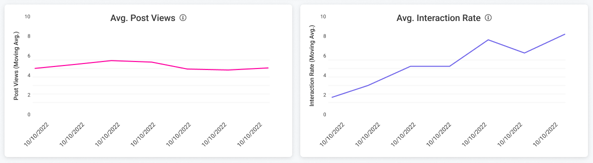
Avg. Post Views per Employee
The average number of posts viewed per employee.
Avg. Interaction Rate
The average interaction rate by employees over time.
- - -
Mobile: Performance by Employee Segment
This table shows the Adoption of the Mobile App by different employee segments. Scroll across the table to see more columns, and hover over the column headings to reveal further sorting options.
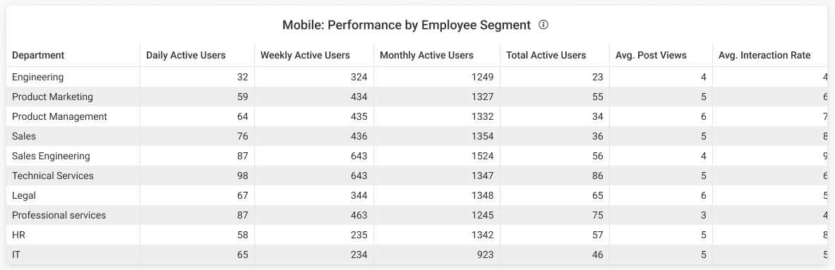
Note: Remember, the breakdown can changed by Employee Segment selected in the filter at the top of the dashboard.
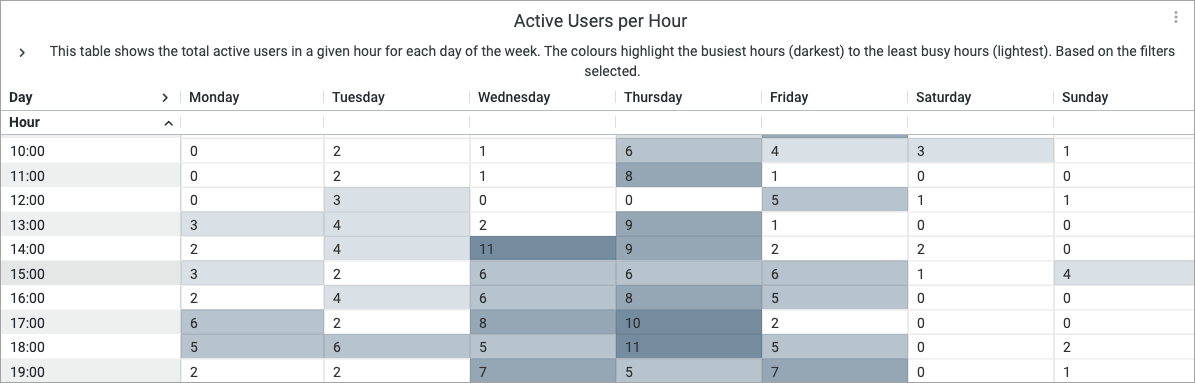
Active Users per Hour
This shows the total active users in a given hour for each day of the week; for all active users for the date range you've selected in the filter. The colors highlight the busiest houses to least busy hours (dark to light).