Images are one of the most effective ways to improve engagement and visual communication in email.
The best image experiences in Poppulo Email come from using high-quality, appropriately sized images that work with the template layout rather than against it.
This article covers:
Note: Poppulo Email is responsive by design. Images may render slightly differently across devices, Outlook versions, mobile applications, and dark mode environments. Minor visual differences between the editor preview and final email rendering are expected.
General Image Best Practices
Use the built-in article image placeholder areas whenever possible
The built-in article image placeholder areas are the recommended way to add images to your content.
Using the built-in placeholder space helps with:
- Maintaining consistent layout and spacing
- Improving image behaviour in the responsive render
- Reducing formatting issues
- Maintaining consistency within the overall template design
Where possible, avoid manually inserting large images directly into rich text areas unless specifically required for the design.
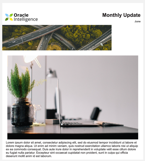
Email stretched due to image in text box being too large.
Choose the right image for the layout
Different content layouts work best with different image orientations and aspect ratios.
Examples:
- Masthead Banners or Hero (Image Top) articles generally work best with landscape images
- 2/3/4 column article layouts work best with landscape or square images
- Full-width or standard articles work best with portrait or square images
Using consistent aspect ratios across layouts helps create a cleaner, more balanced email design and improves visual consistency throughout your communication.
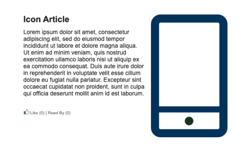
Not the right image container.
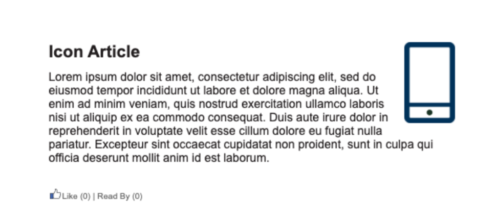
A More appropriate image container.
Use relevant, high-quality images
Images should:
- Be relevant to your email content
- Be brand compliant (check with your internal brand team for guidance)
- Include alt text for screen readers
For best quality, images should generally be uploaded between 800px and 1000px wide.
Uploading significantly larger images may result in compression, which can introduce blurring, particularly around fine lines, charts, or text-heavy graphics.
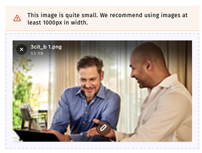
Blurry image and too small.
Avoid placing important text inside images
Important messaging should not rely solely on text embedded within an image.
Text inside images may:
- Become difficult to read on mobile devices
- Scale poorly in responsive layouts
- Create accessibility challenges for some users
- Not be accessible to screen readers
Whenever possible, important information should exist as live text within the email itself.

Blurry image and blurry text due to image issues.
Accessibility Considerations
Always include descriptive alt text
Alt text helps:
- Support screen readers
- Provide context when images fail to load
- Improve accessibility for visually impaired users
Alt text should clearly describe the purpose or content of the image and should be included whenever an image is added to an email.
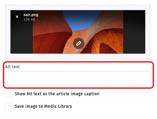
Always use the Alt Text Area.
Be mindful with animated GIFs
Animated GIFs can add visual interest to emails, but excessive animation can negatively impact accessibility.
Too much movement can become distracting and may create difficulties for some users.
Use animation carefully and intentionally.
Use clear contrast in graphics and charts
Charts, infographics, and visual graphics should:
- Use strong contrast
- Avoid relying solely on colour to communicate information
- Avoid small embedded text
- Remain easy to understand at a glance
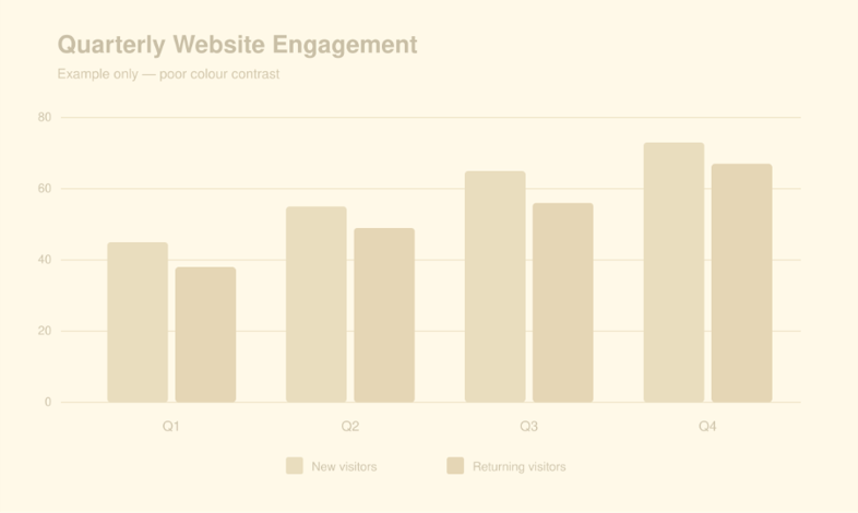
Chart with bad color contrast.
Resizing & Alignment Guidance
Use aspect ratio to balance layouts
For multi-column layouts, consistent image ratios help maintain alignment and visual consistency across sections.
Inconsistent image dimensions may cause:
- Uneven layouts
- Irregular spacing
- Misaligned article sections
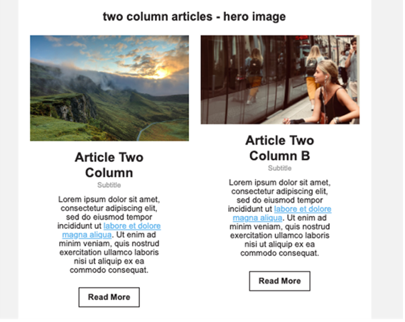
Misaligned image.
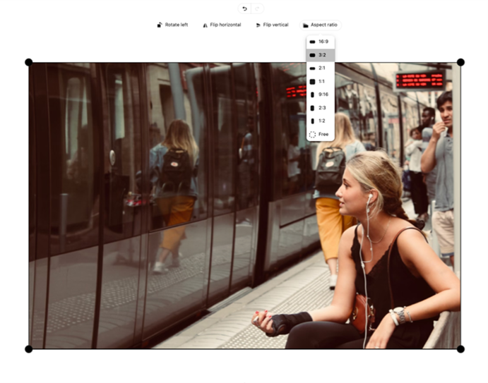
Changing the Aspect Ratio to make them both the same.
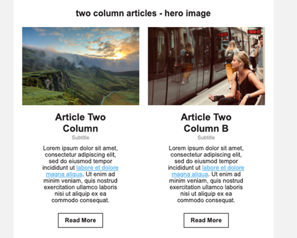
Images Aligned.
Resize images carefully
Images can be resized directly within the summary or content editor when needed.
Avoid:
- Excessively stretching smaller images
- Uploading screenshots with small embedded text
- Using images with very thin borders, as these may appear pixelated after resizing
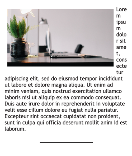
Image too big for area and needs to be resized.
Dark Mode & Responsive Design
Consider dark mode rendering
Some logos and graphics may display differently in dark mode email environments.
Best practices include:
- Testing logos in dark mode where possible
- Using solid backgrounds or white keylines if needed
- Avoiding transparent graphics that may disappear against dark backgrounds
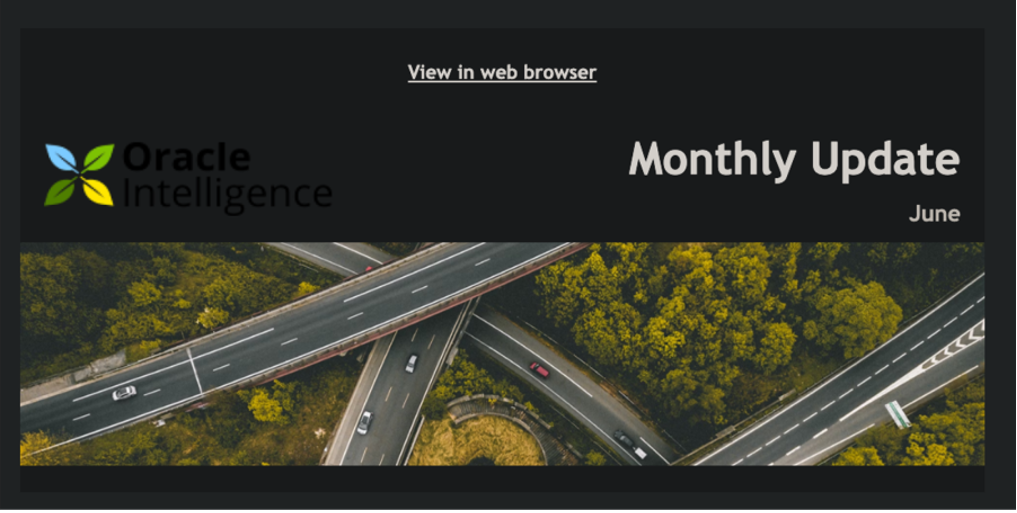
Logo lost in Dark Mode as it has a Transparent Background.
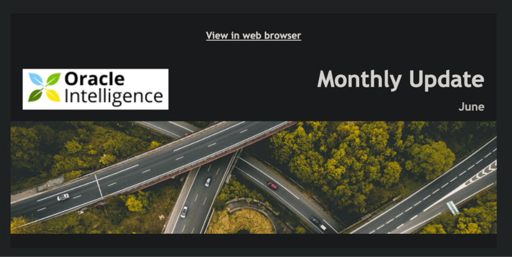
Logo in Dark Mode that has a White Background.
Expect responsive rendering differences
Email clients and devices may render images differently depending on:
- Screen size
- Outlook rendering behaviour
- Mobile responsiveness
- Dark mode settings
- Email client limitations
Minor visual differences between the editor preview and final email rendering can be expected.
Testing before sending remains the best way to understand how your content will appear across different environments.
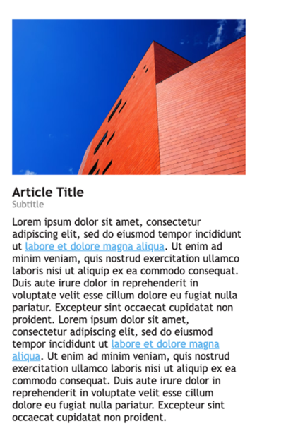
Mobile render of image in Article Image Placeholder.
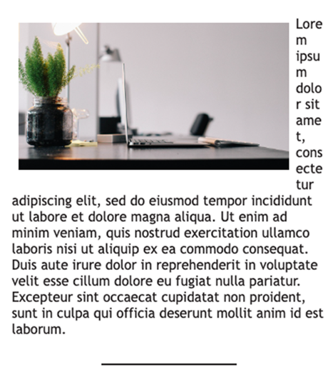
Mobile render of image in Rich Text Box.
