The Engagement Report screen features a set of reports that allows you to quickly view metrics on how your audience interacts with your emails and what type of content they engage with. It's a great way to spot trends, and you can use the insight to influence future communications.
To View your Engagement Reports:
-
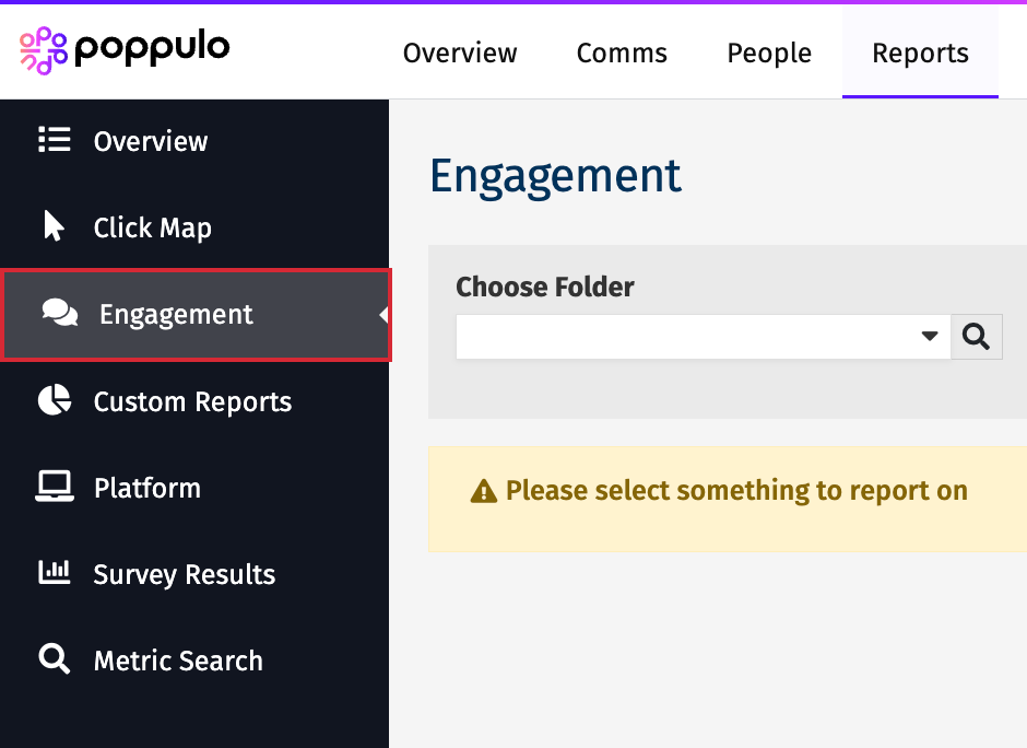
In the Reports area of your account, select Engagement from the menu on the left.
-
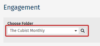
Choose a Folder from the drop-down to access reports on that Folder.
-
5 Reports will be generated, based on the chosen Folder. Each report is interactive.
You can:
- Toggle between viewing results between General or Core Readers.
- Change the amount of months you would like to report on.
- Download the results.
- See a description of what each widget covers.
The Five Engagement Reports
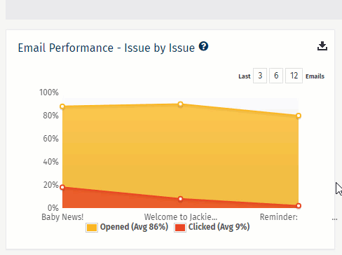
Email Performance - Issue by Issue:
Displays the opens and clicks for the selected number of emails, allowing you to easily spot Emails that resonated with readers, as well as those that didn't.
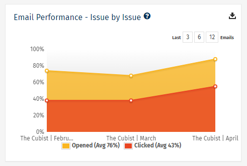
Note: The yellow shows what percentage of recipients opened an email, the orange show what percentage clicked something in the email. This is powerful data over multiple emails.
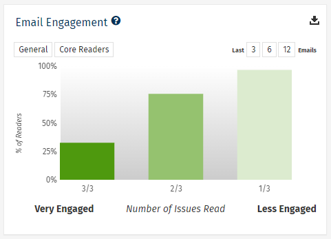
Email Engagement:
Shows how many employees have repeatedly viewed emails sent from your chosen Folder. You can see how many People are viewing every email you send (3/3), as well as those that you need to reach out to (0/3).
Internal Communications Email Benchmarks:
Displays how your Open and Click rates compare to other Internal Communication customers using Poppulo Harmony Email. The average Open and Click rates across all customers are aggregated to provide benchmark scores. Toggle between Opens and Clicks to see how you stack up.
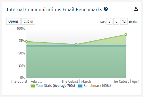
Note: Benchmark statistics are a guide. The culture within individual organisations varies greatly, so don't worry if you're below the benchmark scores. If you'd like to try improve your scores, speak to Poppulo Support.
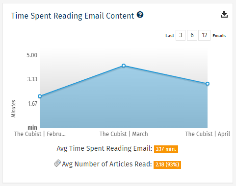
Time Spent Reading Email Content:
Displays the average amount of time that your employees had emails open within their browser for each issue.
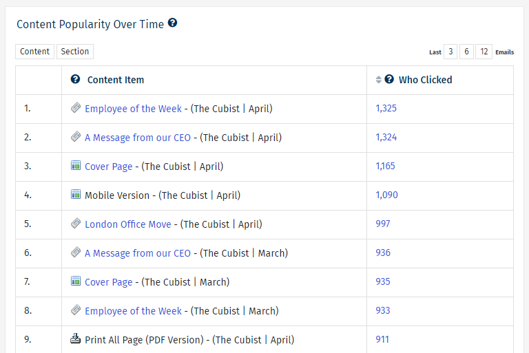
Content Popularity Over Time:
This widget ranks your most popular individual articles over your selected time period. You can see the title of the article (clicking on the blue title will open the article itself), as well as the Folder it was sent from and the date it was sent.
-
You can click on the blue Who Clicked figure to see the individual People that read each article, making it easy to send follow-up communications to employees.
-
This report is particularly useful for spotting trends in the type of content that your audience respond well to and find most engaging.
