The Overview in Email reports shows an Email Account Overview on a number of different aspects of the activity and performance of Email communications in your Account.
If you do not have Advanced reports, please refer to our article Reports: Overview Reports.
This article provides information on how to find this report, how to filter it, and a break down of the various report tiles within the Email Account Overview dashboard.
Note: It can take up to 24 hours after an Email send for data to process and display in this report.
Note: Within your Poppulo Harmony account, you can hover over the info markers on each report tile for further information as needed.
This reports is available as an Enterprise and Sub-Account report. At Sub-Account level, data is only related to the Account that you viewing the report in.
The Enterprise Report will display aggregated data for all sending Accounts within your Enterprise.
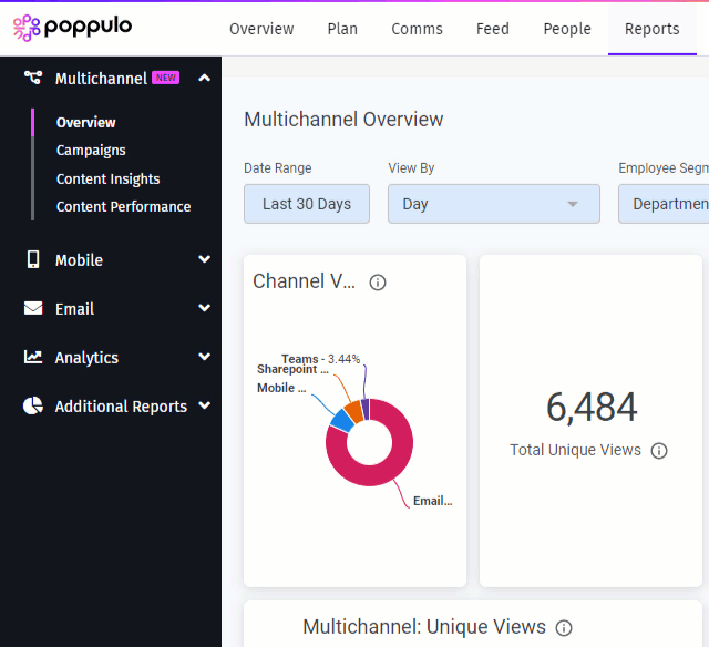
In the Reports Area of your Account, select Overview from the Email reports menu on the left.
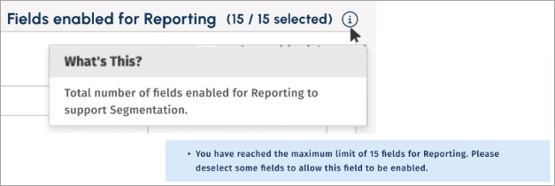
For improved reporting, you may select up to 15 fields.
-
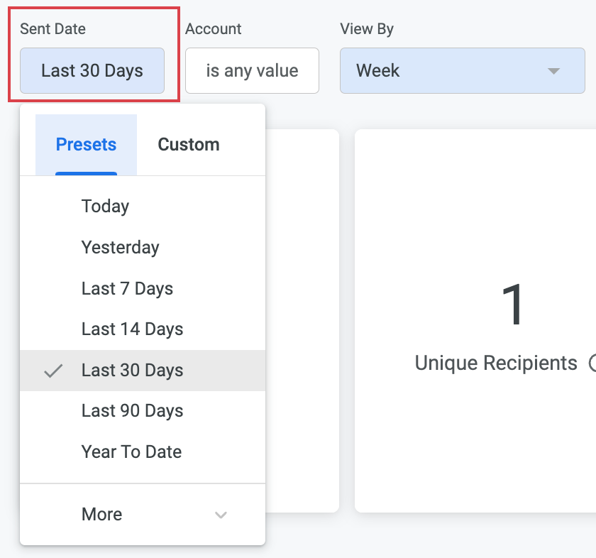
These reports can be filtered by Sent Date; Standard Date Range filter based on Email send date. You can select from preset or custom date ranges.
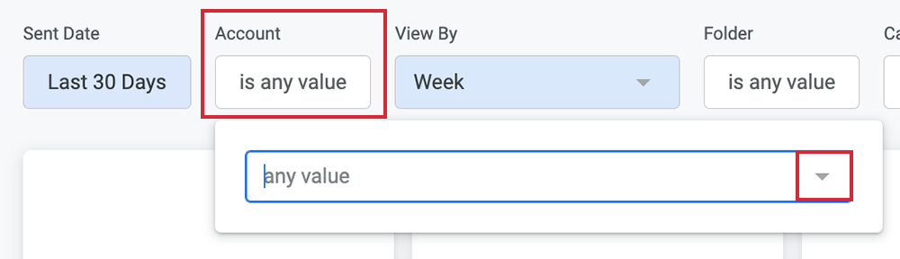
The results can also be filtered by Account Name; From Enterprise level you can select one or multiple Sub-Accounts. At Sub-Account level you can only view data for the Account you are within. Select the drop-down arrow to choose the Sub-Accounts of interest.
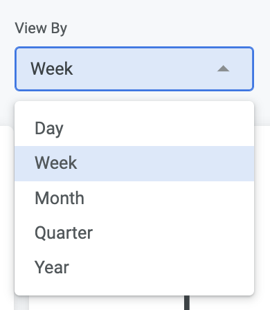
You can View By Day, Week, Month, Quarter, Year.
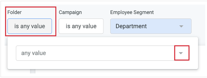
Select one or multiple Email Folders to view the related data. Select the drop-down arrow to choose your folder.
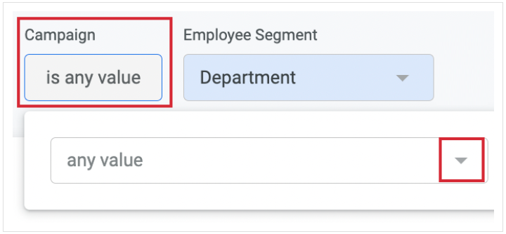
You can filter by Campaign. The default option is any value. Select the drop-down arrow to choose your Campaign.
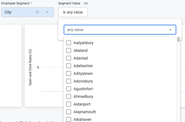
You can filter by Employee Segment. You can ‘Select Segment’ from the dropdown, which contains 15 pre-defined segments that correspond to your people fields. Updating this filter only impacts the ‘Performance by Employee Segment’ table. Note that any segment values which have less than 10 results will not be exposed in this table.
-
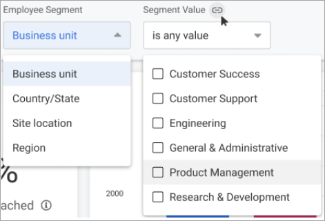
And you can select Segment Value, which lets you drill down into the details of your selected Employee Segment. Updating this filter impacts all tiles and tables in this report
- Whenever you make changes to your filter, remember to select the Update button, at the top right of the screen, to view the updated results.
The following section is a break down of each report tile in the
Email Account Overview dashboard.
Note: You can also Download Reports, from any of your report tiles, by hovering over the tile, selecting the Tile Actions (the 3-dot icon), and choosing Download data. 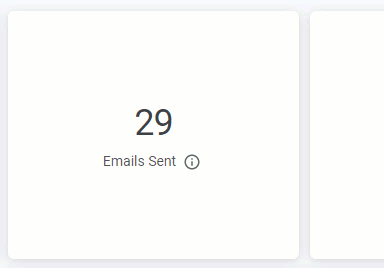
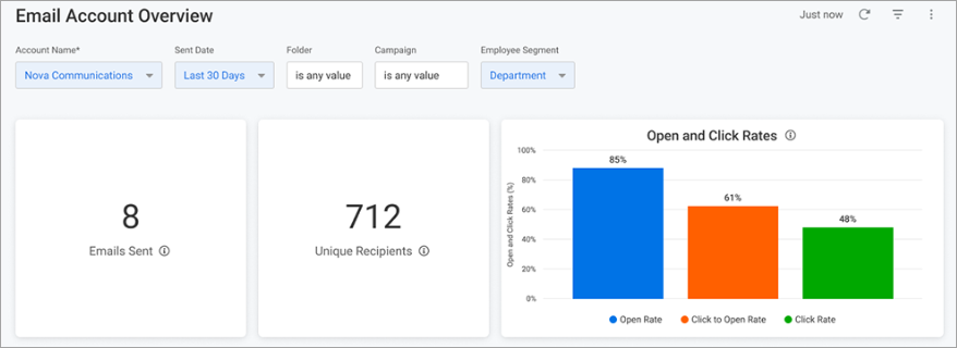
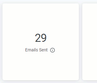
- Emails Sent: Number of unique Emails that have been sent from the Account within the filters selected.
- Unique Recipients: Number of individual people who received an Email within the filters selected. Note: Email sends to recipients that have bounced/not delivered are not counted.
- Open & Click Rates: This bar chart shows engagement rates of Emails falling within the filters selected
- Open Rate: Total unique Email opens divided by the total number of Email deliveries.
- Click to Open Rate: Total unique Email clicks divided by the total number of unique Email opens.
- Click Rate: Total unique Email clicks divided by the total number of Email deliveries.
Email SendersThis table shows sender activity and performance for Emails sent from your Account within the chosen date range. For example, this will inform you how many emails you have sent on behalf of your CEO if you choose to
Change your Default Sender Details.

You can view more columns by using the scrollbar at the bottom of the table.
Email FoldersThis table shows a breakdown of Email Folder activity and performance for Emails sent in the chosen date range. Insight provided includes number of
Emails Sent from your active Folders,
Send Data,
Total Opens and performance metrics for
Avg. Click rate,
Click to Open Rate,
Likes and
Comments.
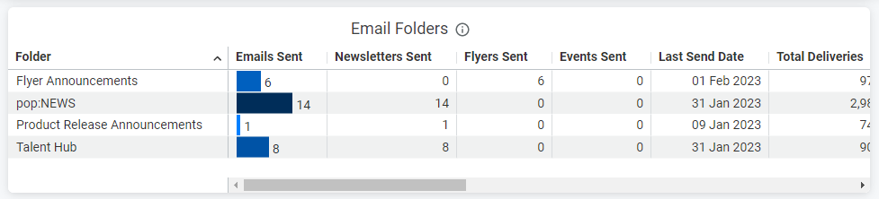
You can view more columns by using the scrollbar at the bottom of the table.
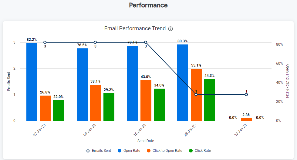
Email Performance TrendThis graph shows the open and click rates for Email sent within the filters selected, displayed over time with the breakdown of Email type for
Newsletters,
Flyers and
Events.
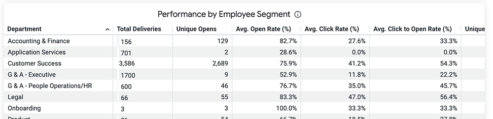
 Performance by Employee Segment
This table shows the performance of the Employee Segments selected at the top of the dashboard. Information is displayed for Total Deliveries, Unique Opens, Average Open Rate, Average Click Rate and Average Open to Click Rate. Scroll across the table to see more columns, and hover over the column headings to reveal further sorting options.
 Related Articles:
