Mailing Performance allows you to view the results and performance of your Emails, giving you a general outlook on the success of your communications. Choose a Folder and an Email, then Poppulo Harmony will generate a Reports Overview of your Mailing Performance.
Note: If you do not have Advanced reports, you can view a similar dashboard through Reports: Overview.
To View your Mailing Performance.
-
In the Reports area of your account, select Email from the menu on the left and choose Mailing Performance. You will need to select which email Folder to report on.
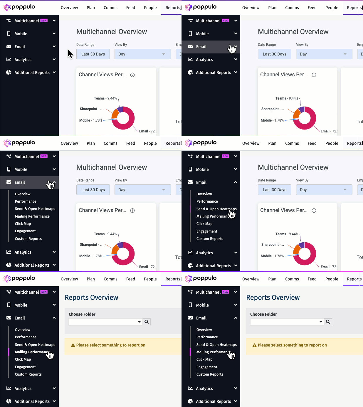
Each tile for the Mailing Performance dashboard is explained below.
Core Readership
This chart illustrates the percentage of employees that have read 1/3, 2/3 and 3/3 of the last 3 emails sent. It shows your most active readers (Core Readers), and least active. You can view which employees are in each segment simply by clicking on it.
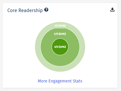
Note: If there are no external link clicks for an email, then the Core Readership chart will show, otherwise the Top Destinations chart will show.
Top Destinations
This reports shows where readers are most commonly taken when clicking on links in your email. It counts up all clicks on links by readers and groups them together in this table. It calculates percentages as a total of all clicks in your email.
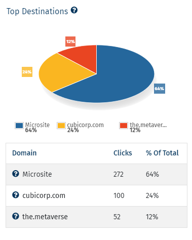
Note: If there are no external link clicks for an email, then the Core Readership chart will show, otherwise the Top Destinations chart will show.
Comments & Social Activity
This widget shows a list of articles or other content from your emails and the employees that commented, liked or shared them.
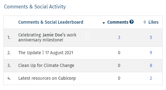
Note: If the Email Folder allows comments, and the communication is an email rather than an event, then this table will show. This can include likes and/or shares
The Overview Reports
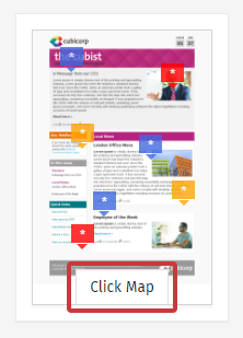
Click Map:Select
Click Map for a visual heat map of your employee click activity. The
Click Map helps you to see how your employees are engaging with your emails (see
Advanced Email Reports: Click Map).
 Results:
With the
Results report, you can see who is and who isn't opening your emails. The results report includes the Delivered To information and the
Opens and Clicks for the selected email. Click the numbers in blue to view a list of employees. You can even
Resend to People Who Did Not Open.
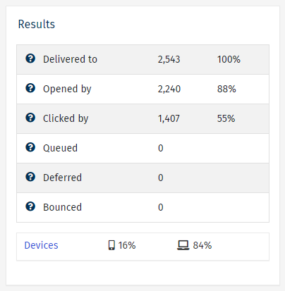 Note: Click Devices to view further information on which devices were used to view your content (see Platform Reports).Email Performance - Issue by Issue:
With the
Email Performance - Issue by Issue report, you can compare your most recent email activity. These trend reports will automatically compare your open rates and click rates, and calculate averages over time, allowing you to easily spot emails that resonated with readers, as well as those that didn't.
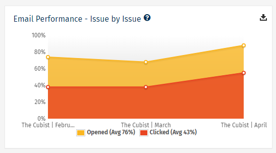
Note: The yellow shows what percentage of recipients opened an email and the orange shows what percentage clicked something in the email.
Content Popularity:
This widget ranks your most popular individual articles in the email. The Content Popularity report shows every clickable item within your email, including URLs or videos watched. This report is particularly useful for spotting trends in the type of content that your audience responds well to.
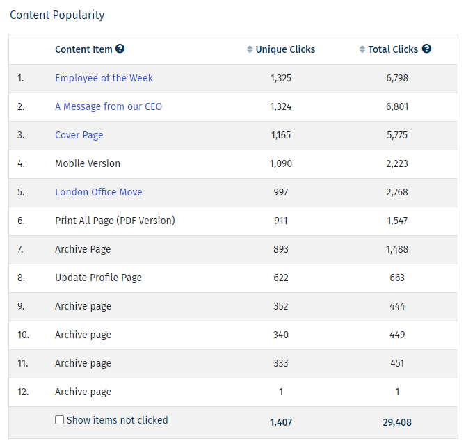
Note: In the Unique Clicks column, if the number is listed in blue, you can select the number to see the individual employees that clicked each article, making it easy to send follow-up communications to employees.
Additional Reports
Choose a Folder and an Email from the drop-downs.
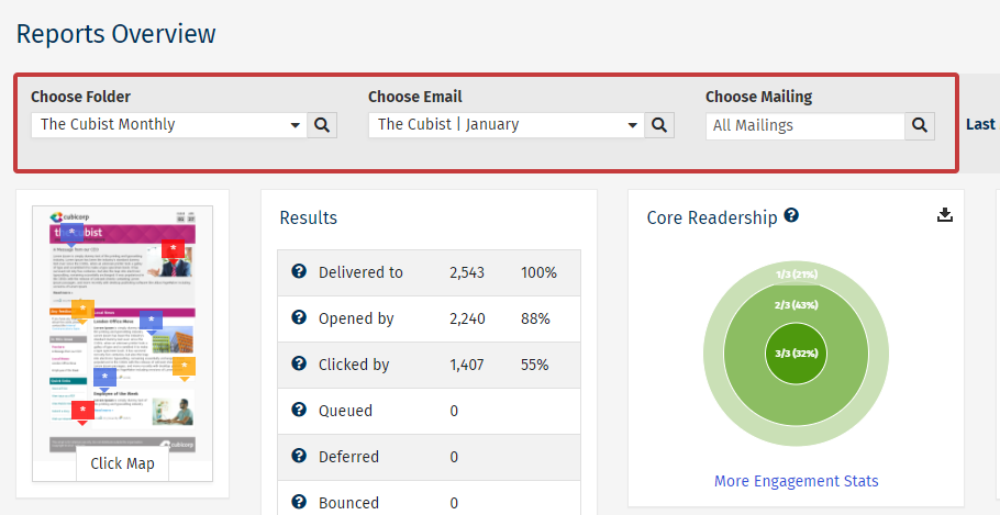
Note: You can also choose a particular send for you email in the Choose Mailing drop-down.

