Designing for email is quite different than designing for the web, print or any other medium. Below are our best practice tips for making the most of your email Folder.
Keep it simple
- Emails aren't like complex websites or graphic heavy posters; they should be nicely designed but somewhat basic. This makes it easy for your recipients to read, interact with and respond to your content. The recommended width of an email is 650px.
Don't rely entirely on images to convey your message
-
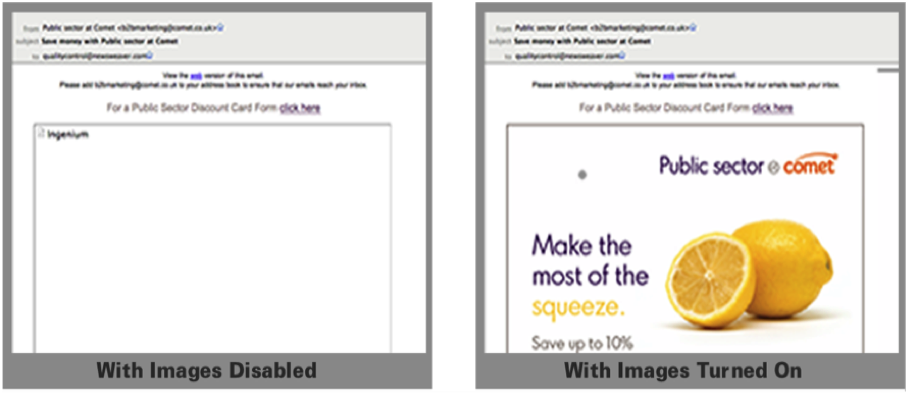
It is important to note the almost 50% of email recipients don't see images automatically as images are blocked by default in most email clients. With this in mind, design you email so that it's coherent if images are blocked.
-
Think about which areas of the email could use live text and design these with a web safe font rather than a display font.
Make content engaging and easy to scan
-
Your readers are most likely to scan your newsletter and may not read every word. Put your main message or call to action close to the top so that it can be seen in the preview pane of email clients.
-
Don't be tempted to cram everything in at the top, use this area to introduce content and persuade readers to read more or scroll down. An effective way to do this is to use a table of contents.
-
Break the design up using section headings and sub headings. 3-4 sentence summaries for articles with a "Read More" link allows you to keep your email short while still allowing for multiple messages. Use images to create interest.
-
Break up your content using columns or different colours to differentiate your primary and secondary content.
-
Guide readers through the content and direct them towards the important information and calls to action.
Make your email template an extension of your brand
-
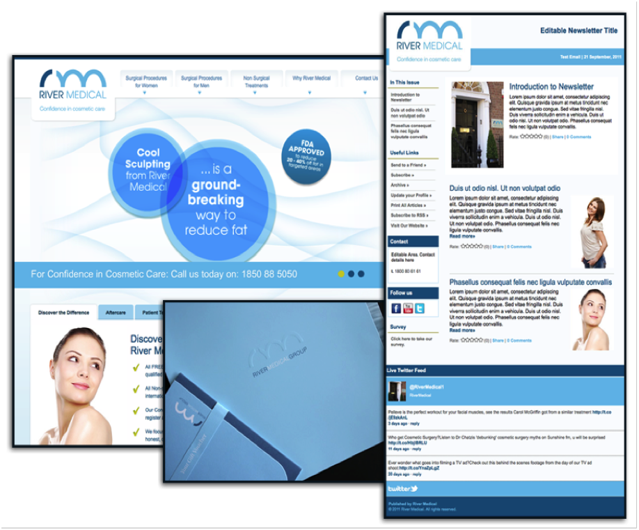
Your newsletter template should match existing branding and other marketing or corporate communications material. This creates a seamless experience for your readers, promotes trust and increases the levels of engagement.
-
In the example below, the website, print materials and newsletter all compliment each other and support the brand.
Features to avoid on the front page of your newsletter

- HTML Forms (e.g. surveys, contact forms, search boxes)
- Embedded Video (e.g. YouTube, Vimeo, Windows Media)
- Flash
- Background Images (e.g. gradient background behind newsletter)
- Live text on top of images
- Large Images (avoid anything larger than 650px x 1000px
Forms, videos and background images are not supported by the majority of email clients. For this reason it is not recommended that you place these on the front page of your newsletter. These features may also reduce the deliverability of your newsletter as they pose a security risk in some cases.
With Poppulo however you can use our unique microsite functionality to include Forms and Videos on the back pages of your newsletter.
Related Articles
